Web design and conversions – is there any connection between them? Apparently, it may look like web design is a concept from the development field, whereas conversion is about marketing. However, this is exactly the case when these two concepts go hand in hand.
According to a recent survey from Stanford University, 46.1% of people stated that a website’s design is the top criteria for deciding if a company is reliable or not. Therefore your design must look professional and attractive. Whether or not your website is visually pleasing it plays an important role in conversion rate optimization.
Your web design can considerably affect your brand image and reliability among new sales prospects. To provide context, it takes website users less than a minute to develop an impression of your website, and 94% of the time, those impressions are determined by your website’s design.
To keep visitors involved with your website content, your web design in canberra needs to be attractive and professional, with instinctive navigation. By implementing successful web design principles, you can influence certain parts of these convictions to your benefit.
Implementing and testing these web design principles will deliver valued insights. Only through testing will you be able to decide which design changes will work best for your website with your particular audience. To start with, let’s discuss some of the important web design principles that will give you an instant and sustainable boost in conversions.
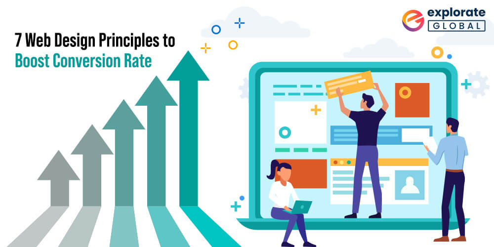
Web Design Principles To Boost Conversions
1. Leverage the Rule of Thirds
The Rule of Thirds is a well-known principle of photography that’s also one of the main web design principles to follow. With the Rule of Thirds, you’re supposed to visually split an image or website page into thirds both vertically and horizontally. As per the rule, the four middle intersections are planned places of interest.
When objects are positioned at these points, it builds the most impactful image or design. In terms of web design principles and elements, you can place the page’s most significant components at these intersections to get people focused on them, enhancing your conversions.
When creating visual images, artists, photographers, and web developers need to stand by the rule of thirds. This principle makes use of a grid of nine intersecting guiding principles to decide where to place the subject matter, which is usually where people’s eyes go.
In web design, placing your points of interest in the intersections or alongside the guidelines on the display will raise the probabilities of your viewers interacting more naturally with your web pages or images. The points where the nine lines intersect are the viewer’s main focus. This principle can be used to decide where to place your call to action button on a Landing page.
2. Follow Hick’s Law
Hick’s Law is a standard theory that’s cited by a variety of individuals for different purposes but is regularly referenced in terms of responsive design principles. Named after British psychologist William Edmund Hick, the law states that the time it takes for an individual to make a decision is directly proportional to the possible choices.
In other words, by growing the number of choices, the decision time is also increased. In terms of website design principles, you can boost conversions by restraining the number of choices users have. The first thing that comes to mind when thinking about where to reduce the number of choices on your website is the navigation bar.
Obviously, you don’t want to have too many links to pick out from, or else, the user will lose interest in them altogether. However, Hick’s Law doesn’t end there. Think about all the important decisions that users have to make on your website, apart from just which navigation link to press.
Here are just a few:
-
- Determining whether to use the navigation bar or scroll down the page more
- Scanning the headlines to see which blog post to read
- Determining whether to download your lead magnet, share your post on social media, or leave a comment
- Selecting between making a purchase, reading product reviews, or browsing for more products
These are only just scratching the surface of the excess of decisions that your users have to make. It’s normal to feel overwhelmed trying to comprehend where to begin cutting back on these decisions, however, there is a simple way to use Hick’s Law in a pinch. All you have to do is install a full-screen welcome gate on your homepage.
A welcome gate covers the complete screen with a single call to action, so the user only sees one choice accessible at first. If they want to see additional choices, they’ll have to scroll down. This allows you to minimize interruptions on your homepage while keeping the functionality of your homepage intact.
Overall, when employing Hick’s Law to your website, you need to know which actions are essential for your bottom line. For example, do you want users to opt-in for your lead magnet, or do you want them to put a product or service in their shopping cart? Every single page on your site should accomplish one main objective. The more you can limit your user’s choices, the easier your website will be to use, and your conversions will space rocket.
Also see: Best Free Ambigram Generators to Make Tattoos
3. Use White or Negative Space
In web design and development, whitespace is often referred to as negative space. Positive space is the space that comprises all the components on your site, while negative space is all of the empty space in between. Regardless of the name, negative space is actually a positive thing in web design; without it, your website would be unreadable and unusable.
Negative space doesn’t just express the space between the larger elements on your page, for example, the space between your header and your content, or space between your sidebar and your content. It also refers to the space between all the smaller elements on your page, like the space between lines of text, the space between paragraphs, and even the space between letters.
Paying attention to all of the forms of negative space on your site helps to keep everything legible, scannable, and relaxed on the eyes. And of course, all of this leads to enhanced conversions.
Make your white space active by generating distance between several elements of your website to highlight essential points. Studies show that space attracts more attention, and subsequently, your viewer will focus more on this part of your web page.
4. Consider F-Layout
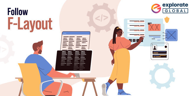
Researchers have found that a user’s natural behavior when surfing the web is to read the screen in an “F” pattern. It shows where the user’s eyes usually land on a webpage: People initially look from left to right at the top of the screen. Then they scan the page downwards, creating small forays into the content. The area of a page that gets the minimum amount of visibility is the bottom right.
So what does this mean for enhancing your conversions? Well, you can take advantage of this behavior by placing the most significant objects and calls to action along the F-shape lines and placing objects of less importance in lesser visibility areas.
For example, you can place your main call-to-action at the top of the page towards the left-hand side because that is where the user will look in the first place.
Then, if you want your user to hang around to read your most recent blog posts, you can place those headlines down the left-hand side of the page. Less important information such as sponsored ads can go in the sidebar on the right-hand side of your page, and you can place the information that you need to acquire the lowest visibility such as a cookie policy in the lower right-hand corner of the page.
5. Color Matters
“Color is an often an underestimated feature of web design but it can play a very significant role in usability as well as express the overall meaning of a brand along with the overall mood of the website,” states designer Tom Kenny. Dissimilar color combinations can evoke different reactions and emotions.
When choosing a color scheme for your website, ensure selecting a combination that evokes the emotion that you want your brand to convey. One practical approach to do this is by curating a Pinterest board with images that reflect your vision for your brand. Then you can upload some of those images to Adobe’s Color Wheel utilizing the camera icon on the upper right-hand corner of the screen.
Once the image is uploaded, it will automatically make a color scheme for you on the basis of the colors in the photo. You can also move the selections around if you want to modify the individual colors. Once you’ve created your color scheme, there is one crucial thing to keep in mind which will create or break your conversions:
Use contrast to keep text, headlines, and call-to-action buttons evident and understandable. In other words, your font and button colors should be in high contrast with the background for example white background with black text, and the components that you want to highlight should be in a color that stands out from the rest of your website.
6. Keep the Design Simple and User-Friendly
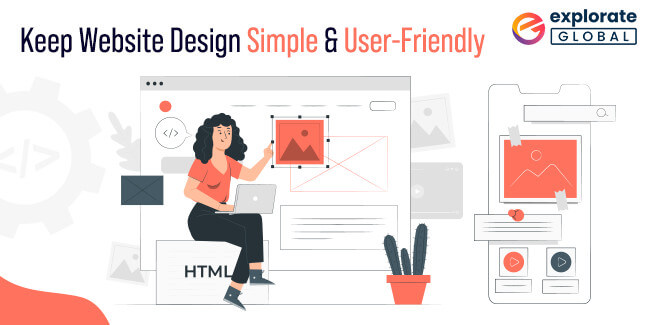
You’ve possibly heard the “Keep it Simple, Stupid” mantra earlier. Well, it’s one of the most significant web design principles as well. Simplicity is the most important factor when it comes to driving conversions. Any time you’re creating a page, ask yourself whether there’s an approach to make it simpler. The result is usually more visually pleasing, and it nearly always converts better.
Remember Hick’s Law? That comes into play here, but simplicity is more than just restraining the choices. It’s about creating a clean inclusive design that is uncluttered and reduces distractions. Similar to Hick’s Law is the fact that individuals can only handle so much information at one time.
Visually, if you see too much stuff all packed into one page, you get overwhelmed and it bothers you a lot. Creating a wonderful user experience on your website means getting rid of anything that isn’t required for the design. Apple is one of the ultimate examples of simplicity in web design, and it is so efficient that countless other brands have followed suit.
7. Utilize Faces to Boost Familiarity
People love human faces. “When we see a face, we are automatically activated to feel something or to relate to that person,” states designer Sabina Idler. “If we identify content on a website such as a problem, dilemma, habit or whatsoever, we feel associated and understood.”
Make sure to integrate faces into your articles, case studies and testimonials, opt-in pages, and landing pages for an enhancement in your conversions. If you are the face of your brand, this is easy to do. Get a photoshoot done, and ensure the photographer takes a lot of horizontal shots with negative space on one side of you.
However, if you aren’t the face of your brand, you can still employ faces on your website by hiring models or using standard photos. Just make sure the faces you select signify your brand correctly so that the user will be able to relate to the face.
Conclusion
The key to building an effective website is understanding how to involve and convert your visitors. By executing the website design principles outlined in this article you’ll have a considerable head start over the huge majority of your competitors. Taking steps to enhance your site’s conversion rate can have a huge positive impact on your business objectives. Adding these website design principles into your business strategy is a great approach to begin to see more benefits from the conversion.
The key to assuring conversion is really in understanding how your market recognizes your brand and the information you deliver through your site. Whether it’s developing a new website or making modifications to an already existing one, these web design principles deliver a firm foundation for boosting conversion rates.
Explorate Global is a renowned web design company that will help you with the web design and development process which will further assist with SEO, expanding your brand image, and eventually acquiring more sales.

 Hire Developers
 Request A Quote